ROLES:
• Ideation
• Prototyping
• Testing
• Visual Design
DURATION:
July 4, 2018 – August 26, 2018
TECHNOLOGIES:
Sketch, InVision, Photoshop, Illustrator, paper wireframes, Protio.io
BRIEF:
Investing in real estate is an increasingly popular way for people to achieve financial security. It is an exciting and emotional experience that can often be complicated. Without professional help, many new buyers have a hard time navigating through all of the information that is available online. Not knowing what they should be looking for, they waste time searching through property listings that are not a good fit.
SOLUTION:
Finding the perfect property shouldn’t be hard. Users need access to reliable, customizable, and uncomplicated information. URprop is a convenient platform for new or seasoned real estate investors to go to find their next property. Easy to navigate, URprop helps you to filter through the crucial comprehensive information such as price, neighborhood, walkability. There is also a feature where you can find what the estimated cash flow will be!
IDEATION:
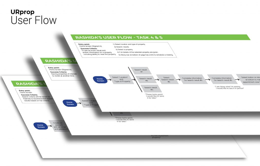
User Flow – Getting a better idea of how a user will use the application is essential. Using user flows I was able to visualize the processes a user would go through to accomplish their goal and see the primary screens would be needed to build to make it happen.
PROTOTYPING:
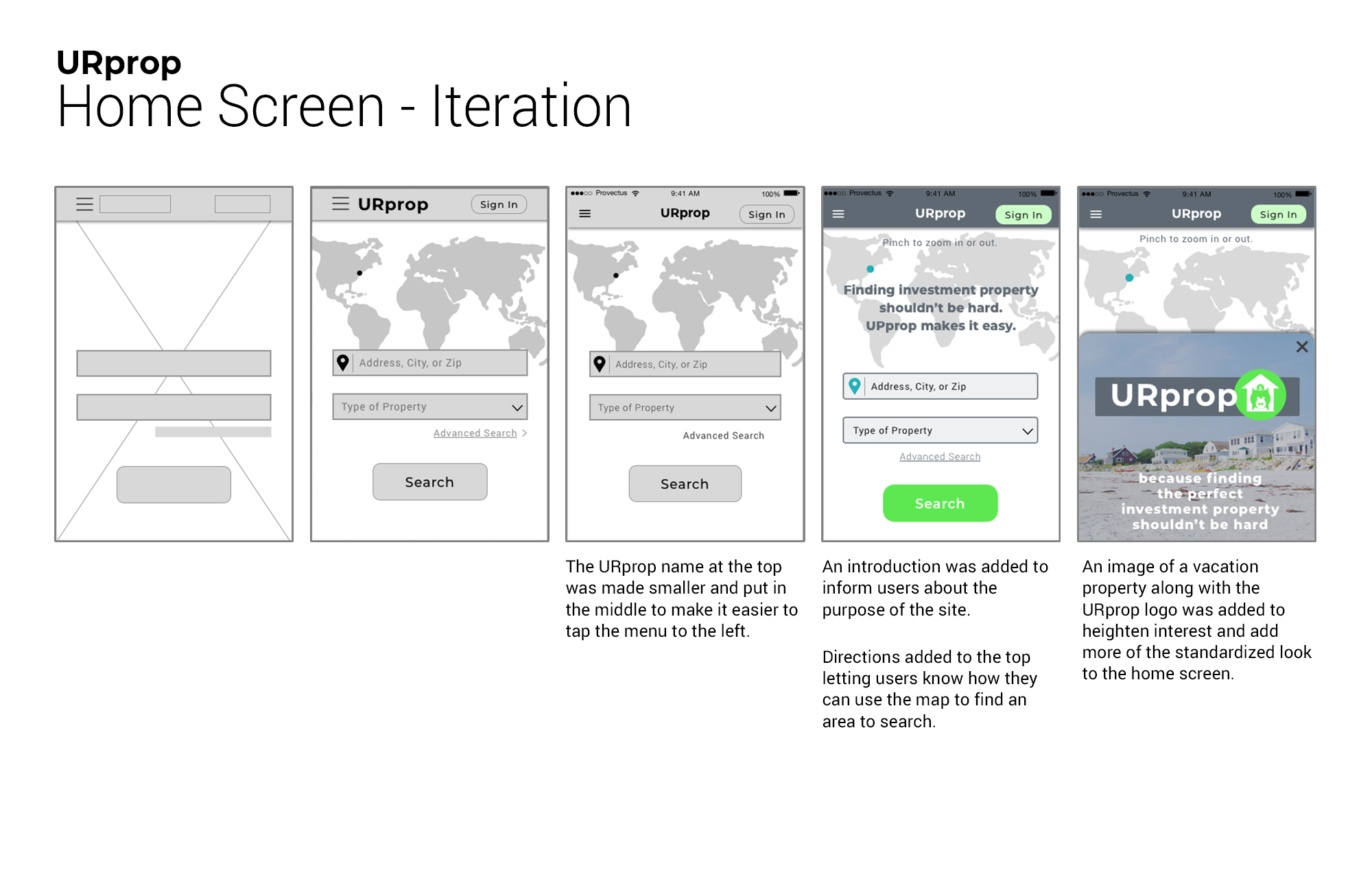
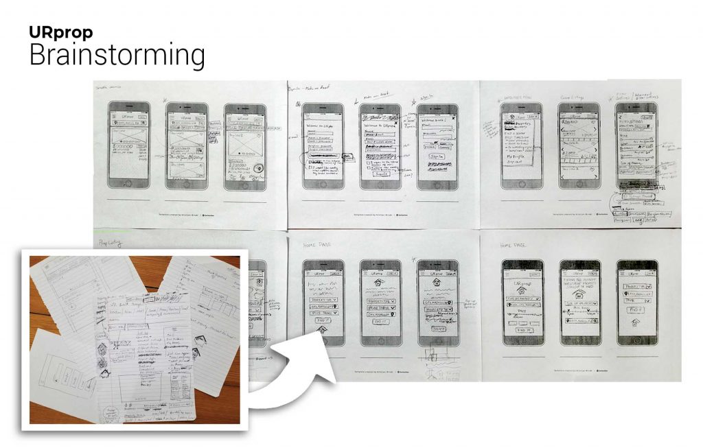
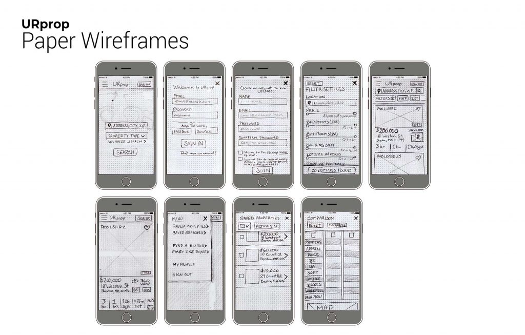
Low-Fidelity – With most users conducting property searches on-the-go when using this application, I used mobile-first design when creating the initial low-fidelity sketches. It was essential to make sure the interface was clean and uncomplicated, so at a glance, users could have all the information they need to decide if they wanted to look further into a property.


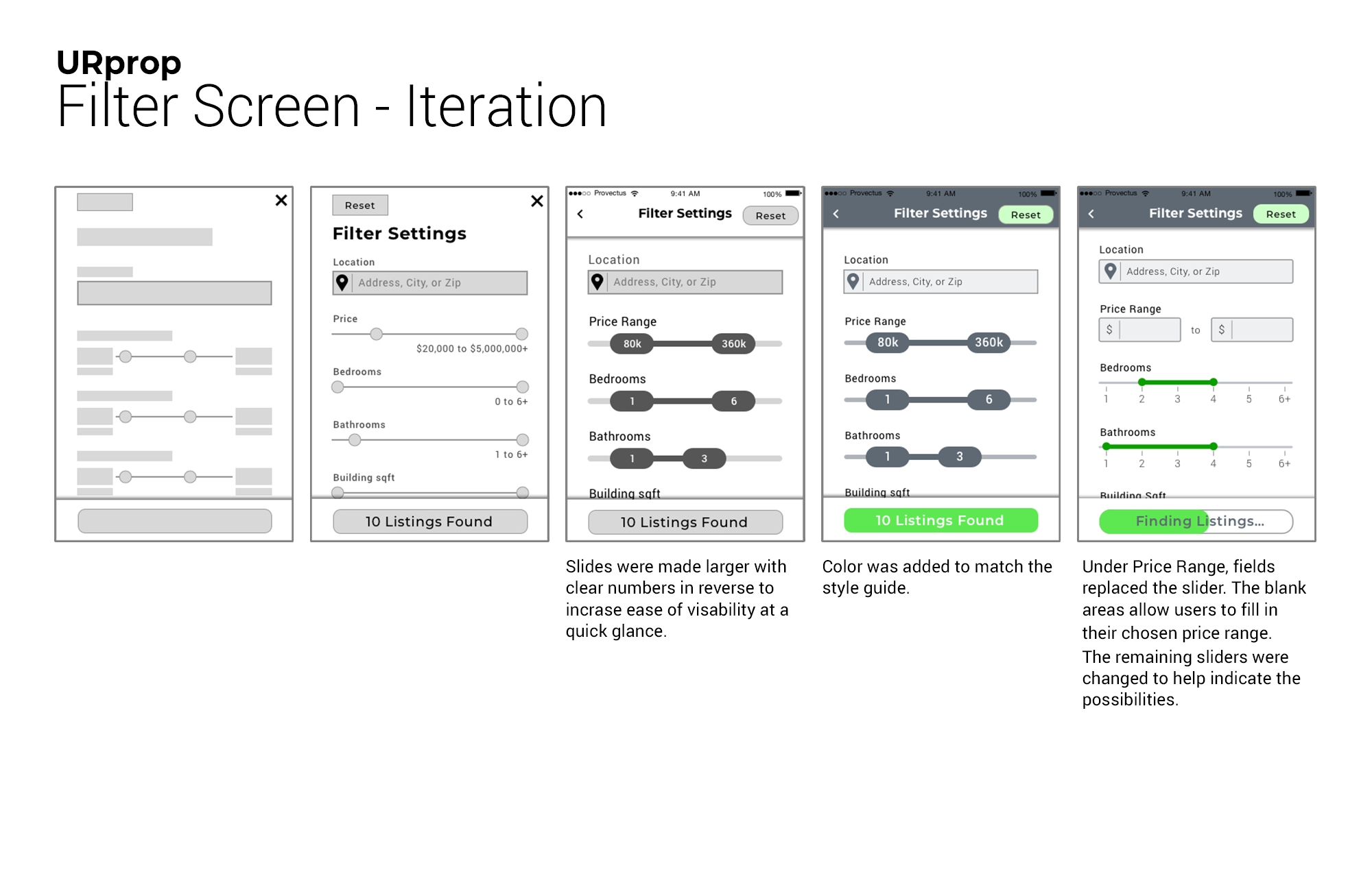
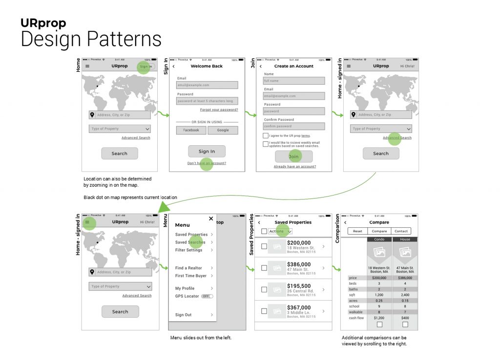
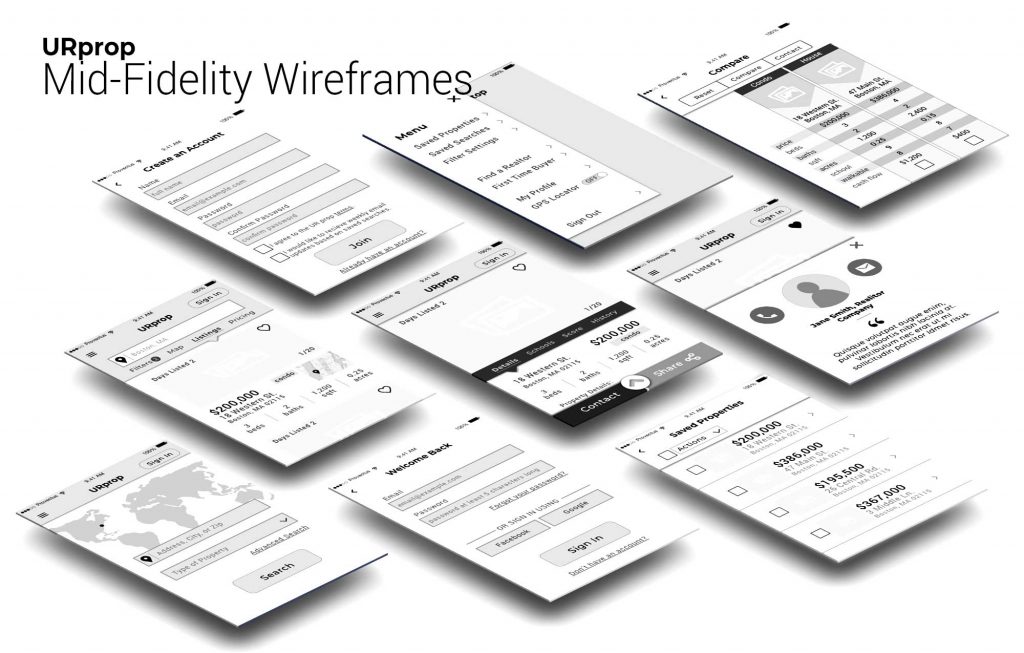
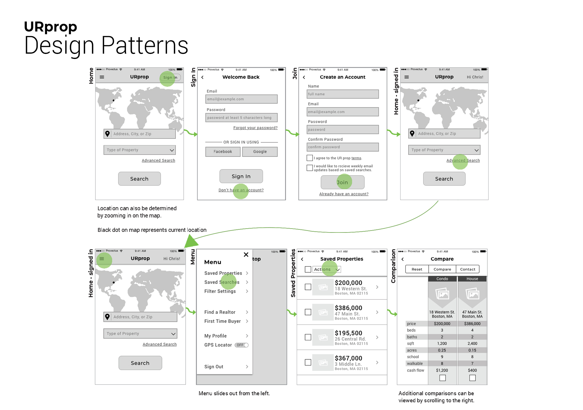
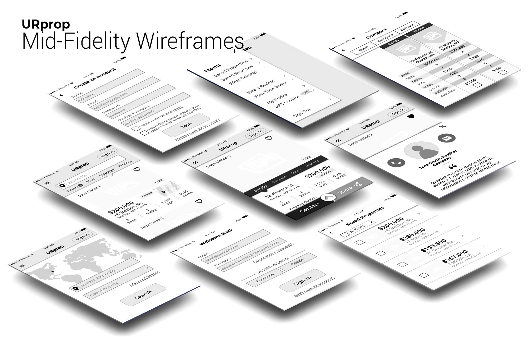
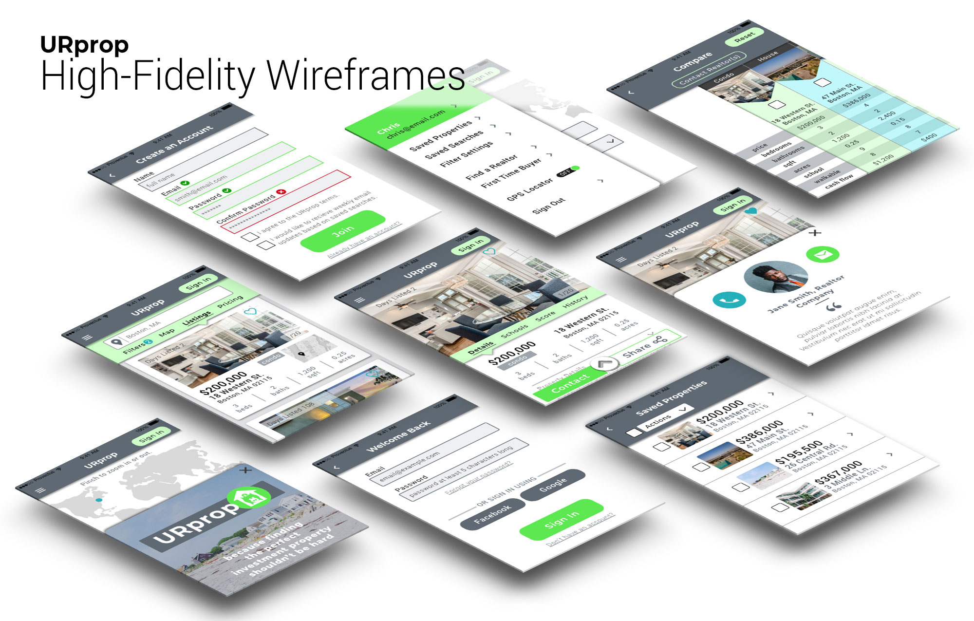
Mid-Fidelity – Sketch was used to develop mid-fidelity wireframes. With the insights from usability testing and using appropriate visual design patterns, refinements were made to the layout.


High-Fidelity Prototype – Sketch was used to develop mid-fidelity wireframes. With the insights from users testing and using appropriate visual design patterns, some refinements were made to the layout.

TESTING:
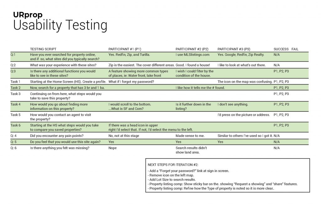
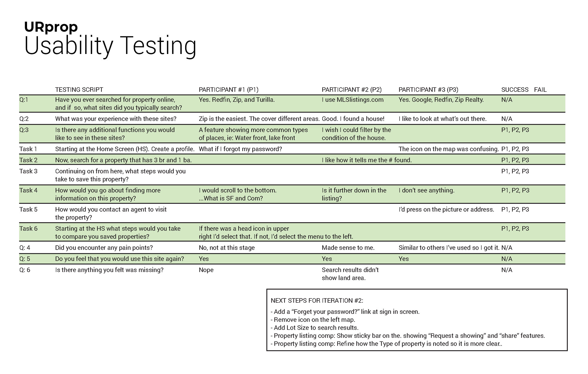
Usability Testing– Participants consisted of one male and two females, between the ages of 40 and 65, currently looking for an income property. The usability test had six questions and six tasks for each of the three participants to complete. These in-person tests focused on navigation of the low-fidelity wireframes and previous experience they had with similar applications. The participant feedback informed me of what they were expecting to see based on their previous experiences and gave me actionable steps for the next iteration. A couple of the steps included adding the property lot size to the info listed on the main property listings and adding a share feature.

VISUAL DESIGN:
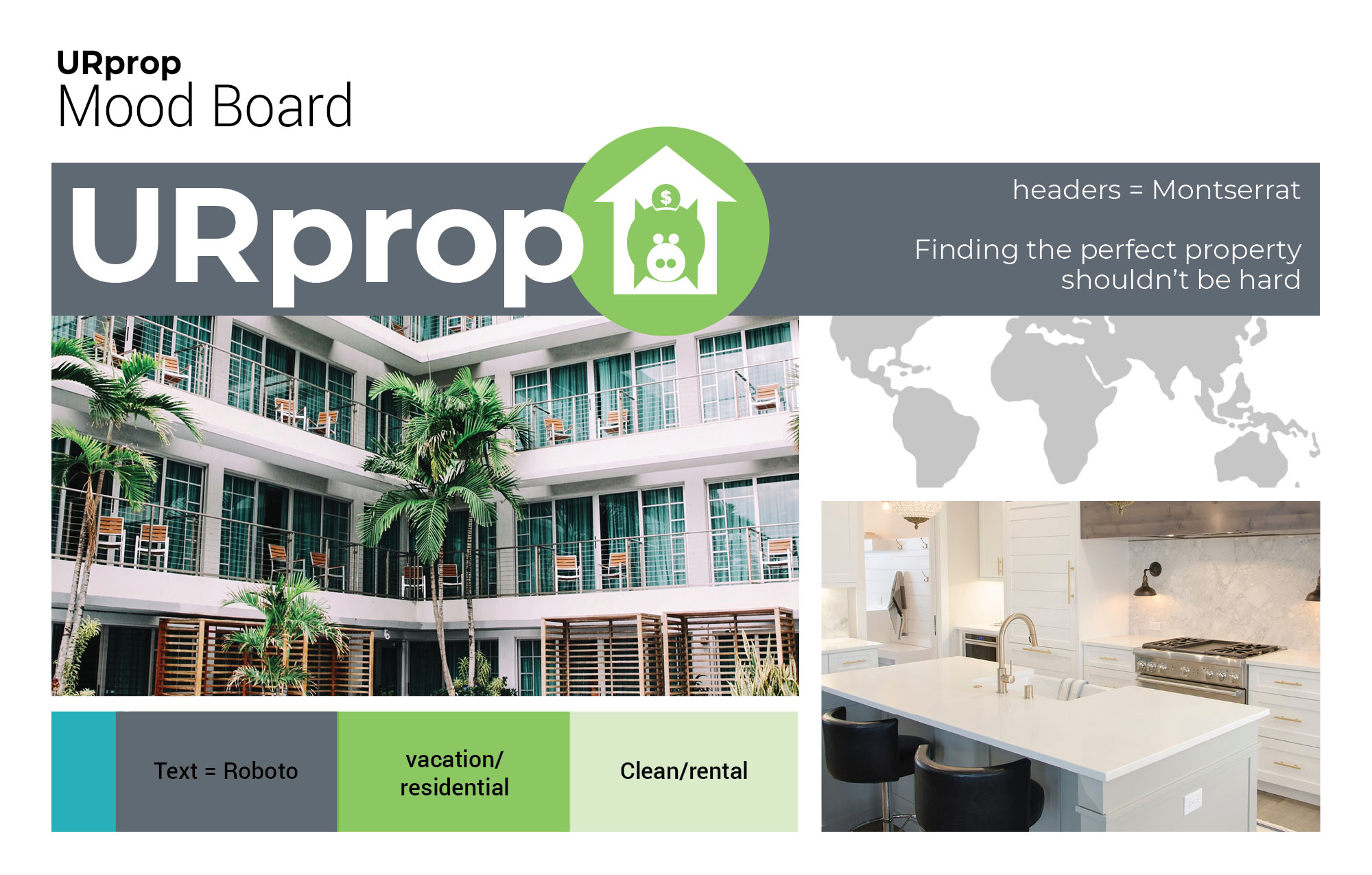
Mood Board – While developing the mood boards to depict the look and feel of the URprop application, I came up with two that I felt would be a good fit, but they told two different stories. One concentrated on a contemporary look and feel of full-time rental properties. These properties would be apartments, houses, condos, and commercial spaces in the city. The other board had more of an open-air feel and focused on vacation rental properties which are usually in areas that have outdoor activities nearby or are close to entertainment.
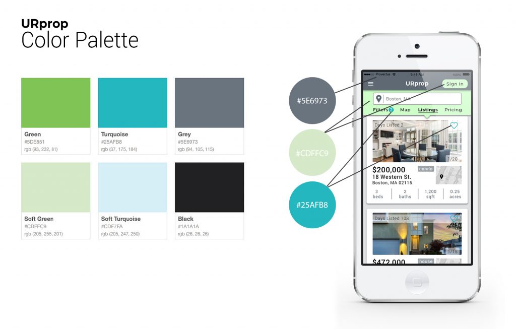
Both options used a green color theme to them to convey money renewal, nature, and growth.
By bringing in some lighter greens into the contemporary color pallet and making the accent color blue, I was able to incorporate both looks into one.

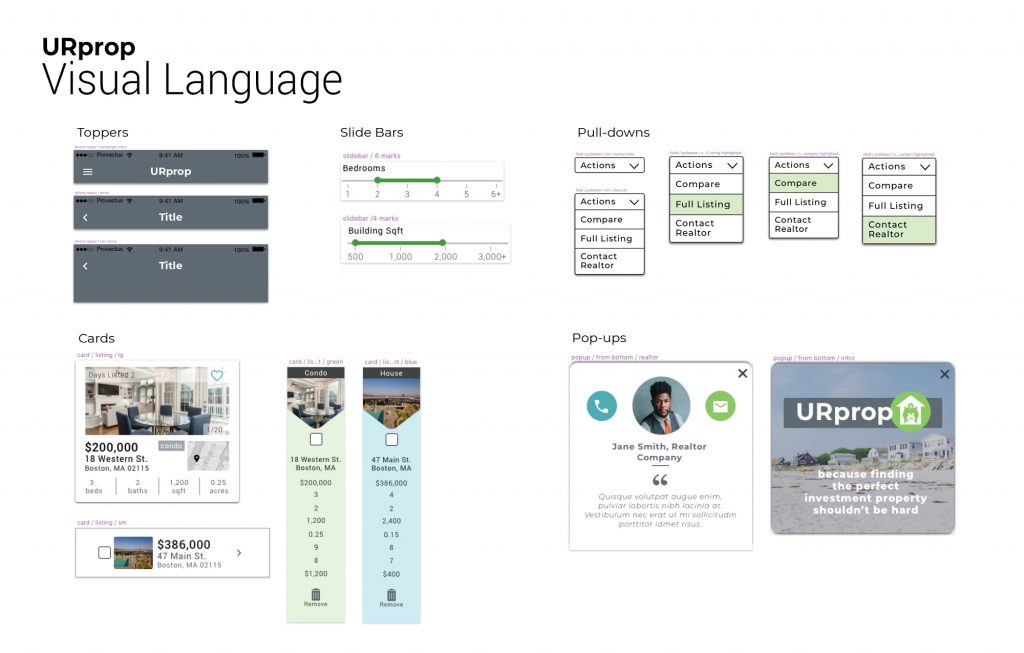
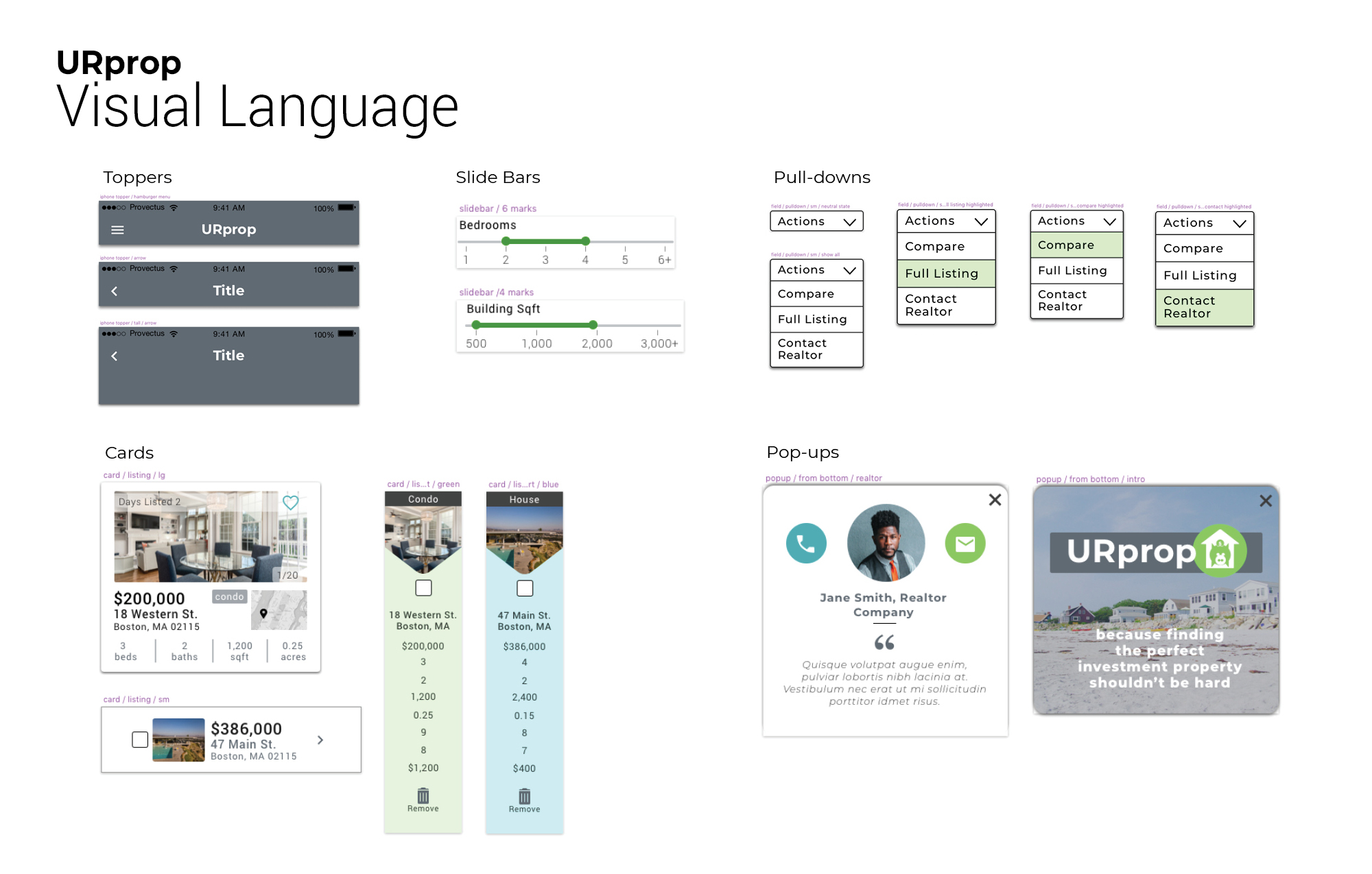
Design Language Systems – I first started with the green color palette that was developed using the mood board. I then moved to the logo. To emphasize that URprop is about investing, I designed a stylised piggybank icon and then placed him inside a simplified outline of a house. The house also takes on the look of an arrow pointing up, indicating the upward momentum of the potential cash flow from a user investing in reality. Keeping with a soft rounded look, I went back and rounded the points of the corners of the logo. Users will be using URprop on-the-go, and they need to navigate the application quickly and feel that it is trustworthy. The visual design language elements are both simple and easy to read with strong contrasting colors.


![]()
![]()

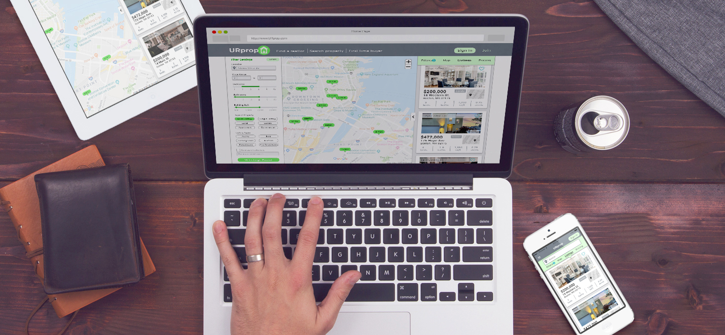
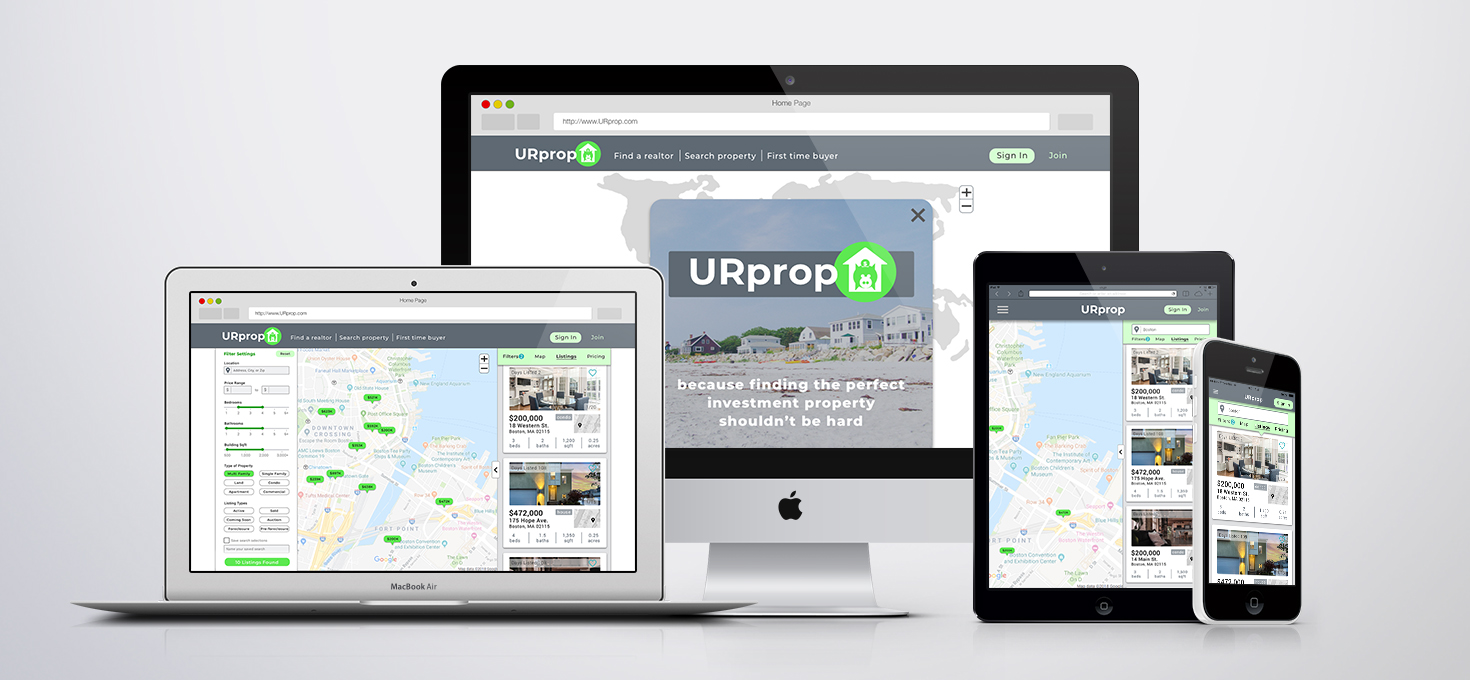
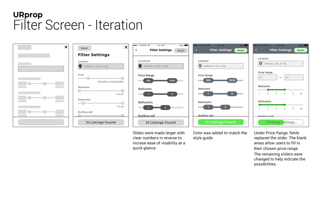
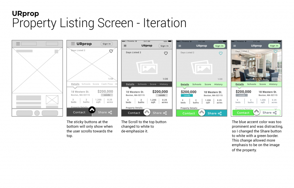
Polishing the Design – From ideation to developer ready files, the UI designs are continuously being improved. The following shows the progression so far.
